Safiyo
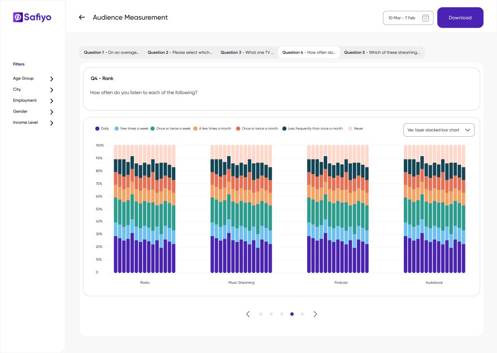
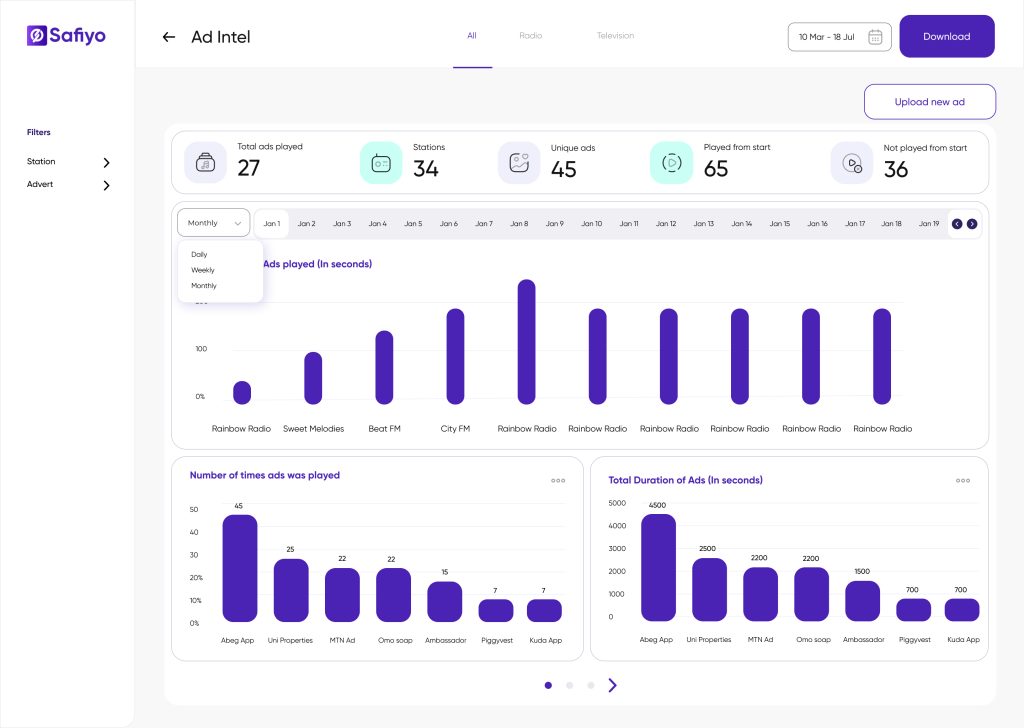
This new dashboard design gave more value to clients that Uber increased its SLA budget from $40k to $250k quarterly, Diageo purchased it in 3 more countries. Why? Clients reported a 47% improvement in their ability to identify actionable insights.The intuitive design and customizable filters allowed users to generate insights 3 times faster than with the previous iteration.
Overview
Safiyo is a B2B SaaS market research tool tailored to help businesses collect, analyze, and visualize consumer data across Africa and other emerging markets. With major clients such as Uber, Kellogg, Diageo, ABinBev, and Spotify, Safiyo enables companies to make data-driven decisions that power their market strategies. As the Lead Product Designer, I was tasked with designing a data visualization dashboard that empowers businesses to transform complex datasets into actionable consumer insights.

Problem
Businesses using Safiyo face the challenge of making sense of vast amounts of data coming from multiple sources—surveys, customer feedback, transactional data, and social media. The existing dashboard, a Power BI embedded data board, lacked intuitive design and flexibility, making it difficult for users to tailor visualizations to their unique needs. Users also struggled with interpreting insights, leading to missed opportunities to drive strategy
Objective
The goal was to create a flexible, intuitive, and robust data visualization dashboard that enables users to:
- Analyze consumer data with ease.
- Customize charts and graphs for their specific business questions.
- Extract meaningful insights quickly and accurately.
Design Approach
1. User Research & Pain Points
Research Methods: We conducted several rounds of user interviews for 3 existing B2B clients for before and after design iterations, compared against the session replays (using Hotjar) and first click tests with 7 participants. We deduced the following pain points:
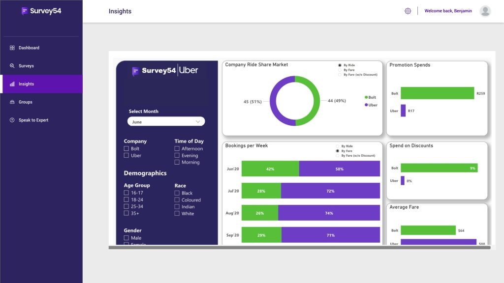
The previous dashboard design: users could not filter by date, lack of user education on what the charts represent and users report difficulty in filtering large data sets
- Complexity in customization: Users found it difficult to configure charts for their specific data needs.
- Lack of clarity in data presentation: The existing charts didn’t effectively convey insights, especially with larger datasets.
- Limited visualization options: Users wanted more flexibility to choose between different chart formats to answer different business questions.
- Technicality: The variation of our core users representing these organisations are not usually research experts. Some of the chart and parameters were too complex for them to interpret
2. Design System for Data Visualization
Creating a robust design system became the backbone of the project. The design system ensured:
- Consistency: Users could switch between different charts (bar, line, pie, scatter, etc.) without losing the visual and functional consistency.
- Scalability: The system could easily accommodate future additions of new chart types and features without needing an overhaul.
- Customization: Each chart type could be customized with filters, data ranges, and formats to align with user preferences and data-specific needs.
Key Components of the Design System:
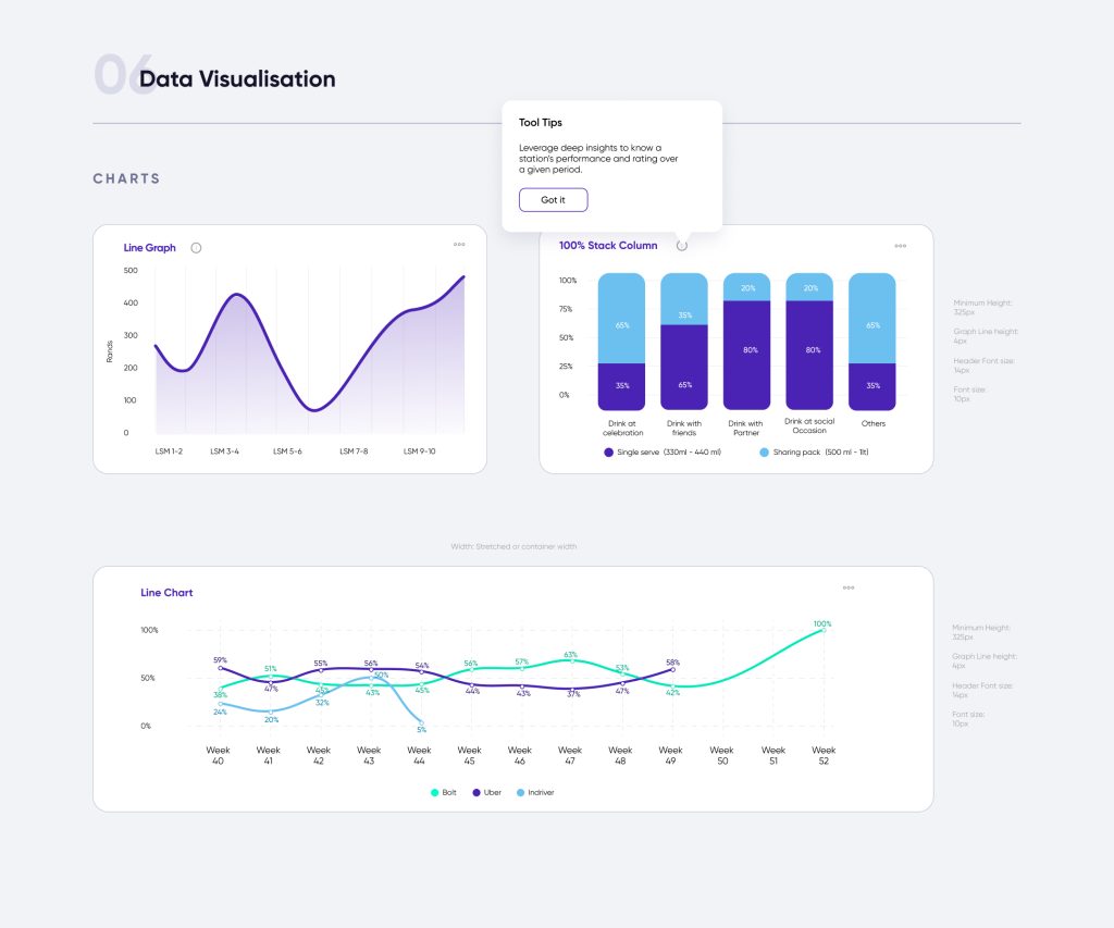
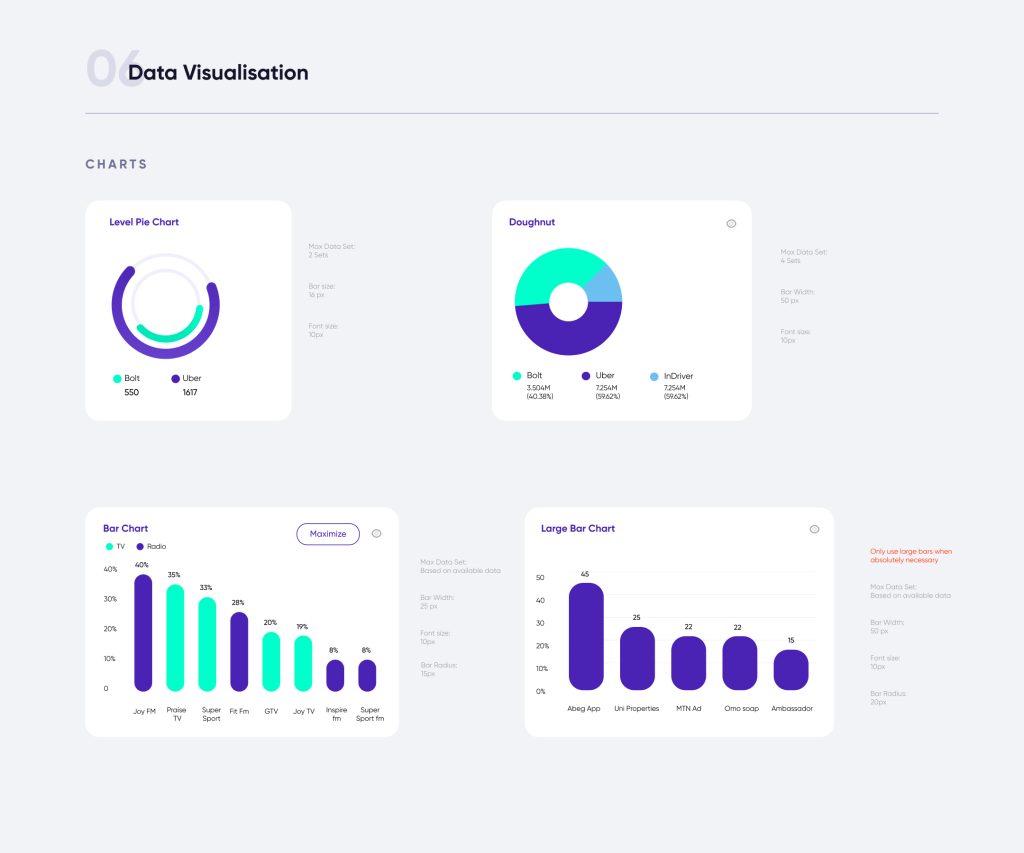
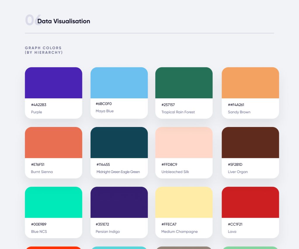
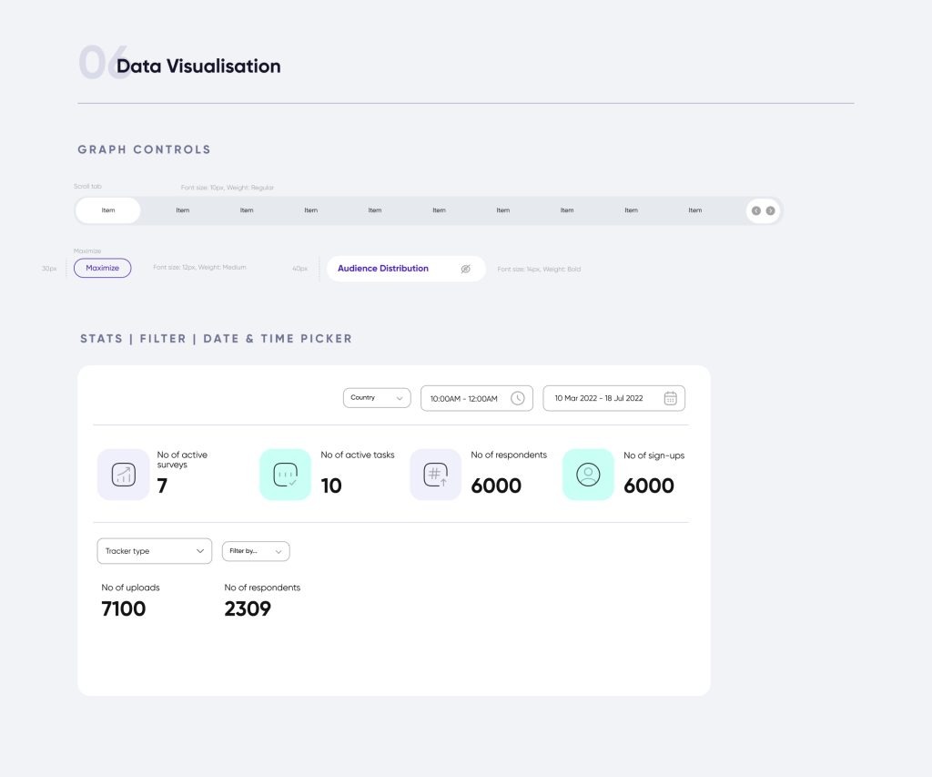
Data visualisation design system : After consulting research stakeholders I develop a reusable component system that includes: 35 unique charts, Stat cards, filters, date pickers, dashboard layout, color chart by hierarchy, Tabs, Annotation, tooltips etc. These shared with developers using Storybook and AM Charts library
- Modular Chart Components: Each type of chart (e.g., bar charts, heatmaps, line graphs) was created as a reusable component, ensuring flexibility and consistency across the platform.
- Color Palettes and Themes: We designed adaptive color schemes to make sure the charts were accessible for users with visual impairments and readable even when datasets grew large.
- Tooltips and Legends: Detailed yet unobtrusive tooltips and legends were incorporated to help users interpret their data quickly without cluttering the interface.
- Dynamic Layouts: We designed dynamic layouts that allowed charts to be resized, combined, or compared side by side, offering full control over how users interact with multiple datasets.
3. User Flow and Interactions

We focused heavily on simplifying the user flow. Users could:
- Upload/Import Data: The system allowed for seamless integration with existing data sources especially the respondent dashboard.
- Filter and Customize: Users could filter their data by demographics, time, or geography, and apply it to different charts.
- Visualize: They could choose from various chart formats and further customize the visualization.
- Export and Share: Visualized data could be exported in multiple formats (PDF, Excel, etc.) for reporting and presentations.
4. Usability Testing and Iterations
Once the first version of the dashboard was developed, we conducted usability testing with existing Safiyo clients. Their feedback led to several improvements:
- Interactive Zooming: Users needed to zoom in and focus on specific data points within larger datasets.
- Customization of Axes: Users requested more control over the axes to make the charts even more tailored to their use cases.
- Preset Templates: To save time, we introduced customizable chart templates based on common use cases such as sales performance, consumer demographics, and market segmentation.
Results
The redesigned data visualization dashboard was a game changer for Safiyo users. It improved not only the visual appeal of data but also the ease of extracting insights. Key results included:
- Increased user engagement: Users spent 35% more time on the dashboard, exploring and interacting with the data.
- Improved decision-making: Clients reported a 40% improvement in their ability to identify key trends and actionable insights.
- Reduction in support requests: There was a significant drop in user complaints regarding data interpretation and chart customization.
- Reduction in analysis time: The intuitive design and customizable filters allowed users to generate insights 50% faster than with the previous iteration.
- 4x faster dashboard implementation: This helped the team to roll out more data visualisation for new businesses 4 times faster than before
Conclusion
The Data Visualization Dashboard at Safiyo empowered businesses with a more intuitive way to analyze complex data for consumer intelligence. The robust design system that underpinned the project ensured that Safiyo could scale its features to meet the evolving needs of its clients, while delivering a flexible, user-friendly interface. This case study showcases how thoughtful product design—driven by user research and a scalable design system—can turn a complex challenge into a powerful tool for business growth.

