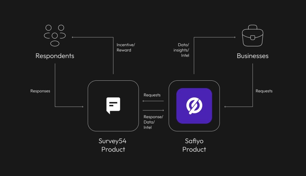
Safiyo
Scaling Data Insights 4x Faster at Safiyo
I led the redesign of Safiyo’s B2B data visualization dashboard, resulting in a 4x faster insight generation rate and a 6x increase in Uber’s SLA spend. The new system supported 35+ reusable chart components and enabled companies like Diageo and Spotify to extract insights 50% faster. My role spanned research, system design, UI/UX, and collaboration with engineering on Storybook integration.
Overview
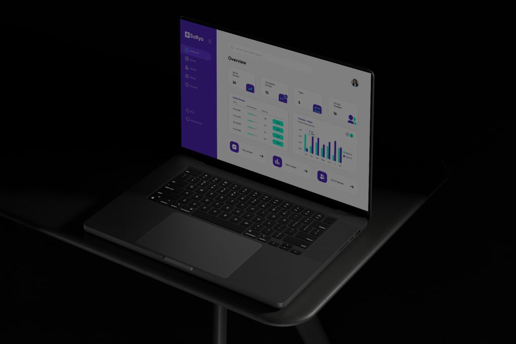
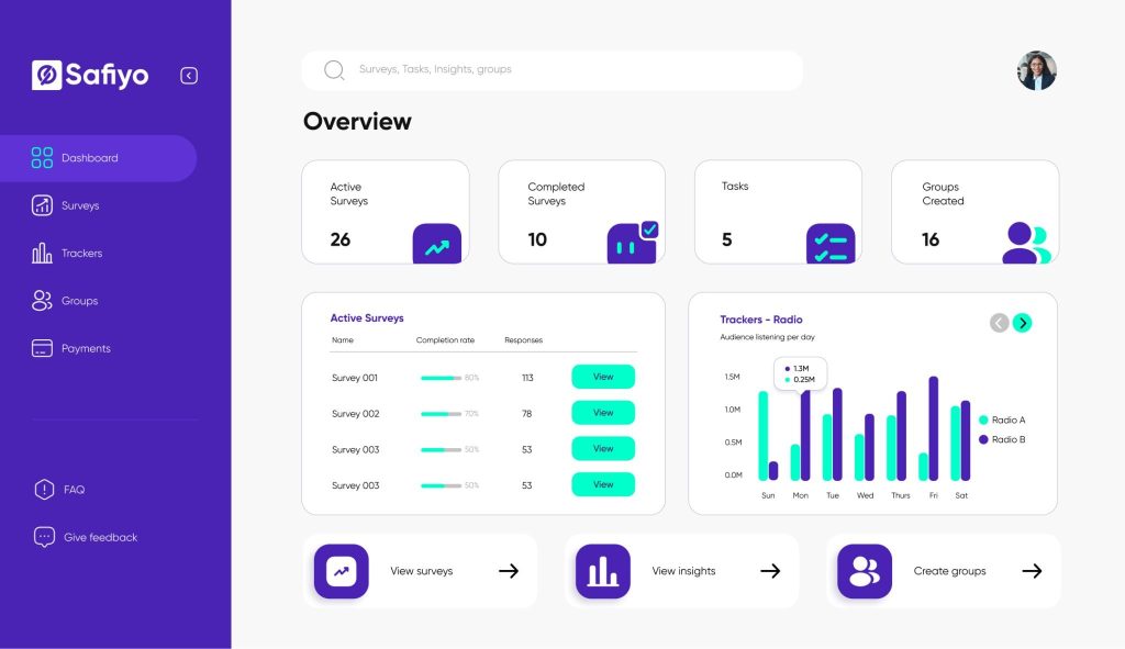
Safiyo is a B2B SaaS market research tool tailored for Africa and other emerging markets. It empowers major clients like Uber, Kellogg, Diageo, ABinBev, and Spotify to collect, analyze, and act on consumer data. As the Lead Product Designer, I was tasked with designing a dashboard experience that translated complex datasets into actionable insights quickly and intuitively.
Problem
Clients struggled to derive value from their data due to:
Rigid visualizations: Users couldn’t tailor charts to business-specific needs and resulted in a low Net Promoter Score (NPS).
Low insight clarity: Datasets were hard to interpret, especially at scale. Only ~23% of new users completed basic task (generating insights).
Missing features: No date filters, segment comparisons, or presets.
These limitations led to delays in strategic decisions and reduced value from Safiyo’s SLA contracts.
Objectives (Design KPIs)
- Enable insight generation 50% faster
Support 35+ flexible chart types
Decrease chart customization time to under 3 clicks
Build a reusable component system for faster implementation
Design Approach
1. User Research & Pain Points
We interviewed 3 key enterprise clients and validated findings with session replays (Hotjar) and first-click tests (7 participants). We identified the following:
Pain Points → Solution Directions:
Difficult filtering → Introduce left-aligned filter panel
Unclear visualizations → Add tooltips, axis customization, and chart presets
Insufficient chart formats → Build reusable components across 6 chart types
Before
The old dashboard presented critical challenges: 1. No date or demographic filtering, 2. Poor visual hierarchy; data-heavy views were unreadable, 3. Required developer support to edit charts. This created bottlenecks and increased dependency on Safiyo’s internal teams.
2.Design System & Component Architecture
We developed a robust design system to support speed, scale, and clarity:
Key Features:
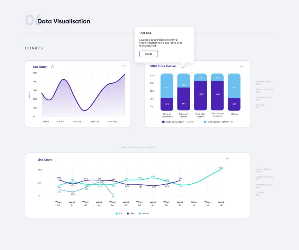
35+ modular components: Line, bar, donut, scatter, heatmap charts
Presets & templates: Sales performance, demographics, market share
WCAG-compliant color themes: Hierarchical palette for visual clarity
Storybook + AM Charts integration: Ensured dev alignment and reusability
The system drastically reduced time-to-deploy for new client dashboards and enabled feature consistency across use cases.
Key Components of the Design System:
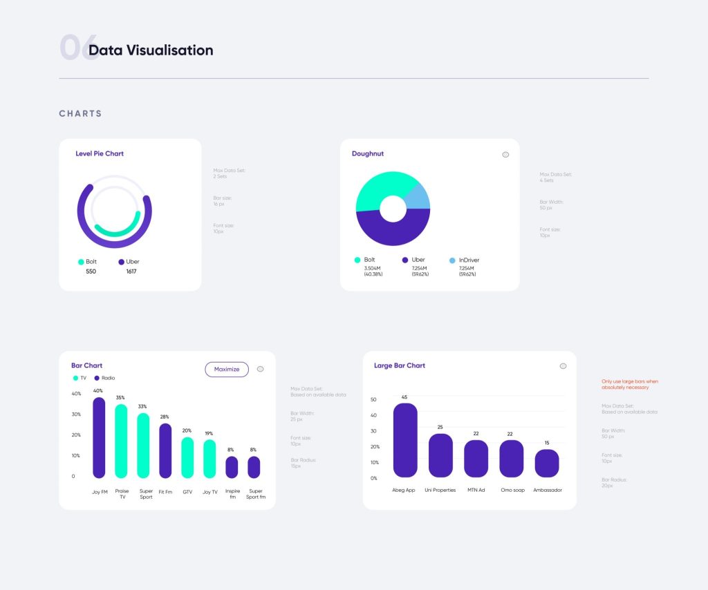
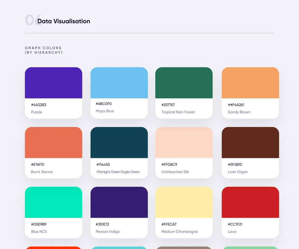
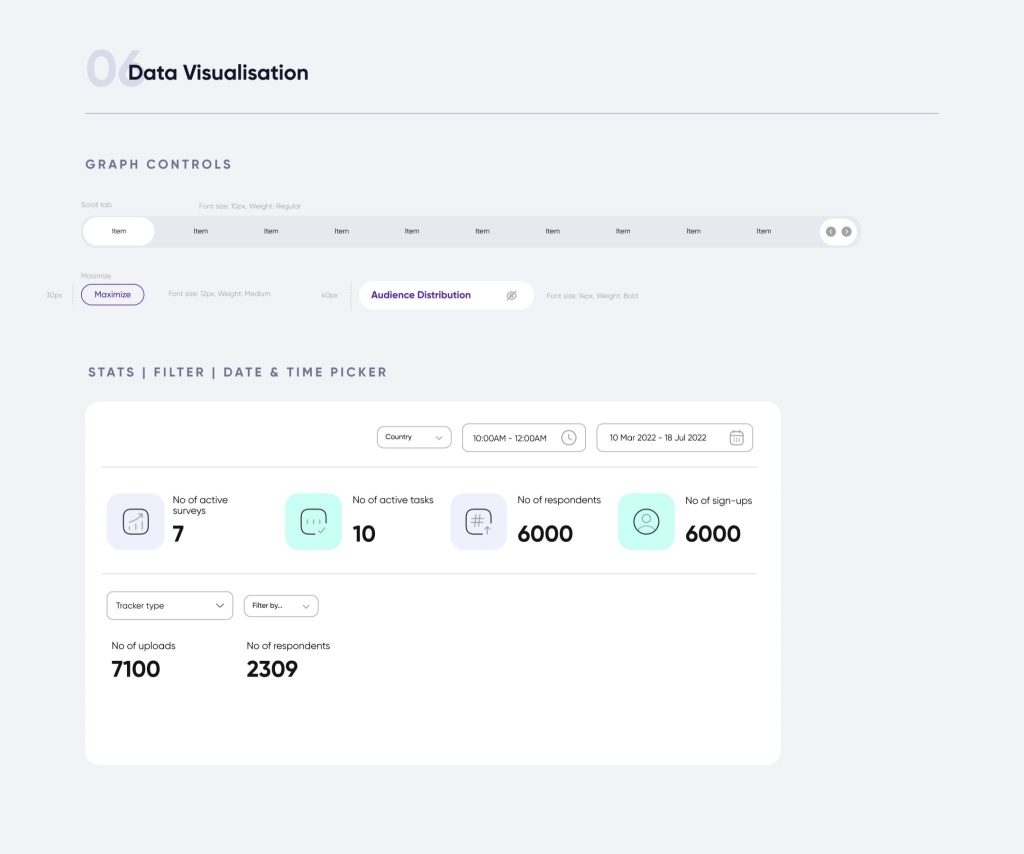
Data visualisation components: After consulting with research stakeholders I developed a reusable component library that includes: 35 unique charts, stats cards, filters, date pickers, dashboard layouts, color charts by hierachy of use, Tabs, Annotations and tooltips. These were shared with developers using Storybook and AM Charts library
- Modular Chart Components: Each type of chart (e.g., bar charts, heatmaps, line graphs) was created as a reusable component, ensuring flexibility and consistency across the platform.
- Color Palettes and Themes: We designed adaptive color schemes to make sure the charts were accessible for users with visual impairments and readable even when datasets grew large.
- Tooltips and Legends: Detailed yet unobtrusive tooltips and legends were incorporated to help users interpret their data quickly without cluttering the interface.
- Dynamic Layouts: We designed dynamic layouts that allowed charts to be resized, combined, or compared side by side, offering full control over how users interact with multiple datasets.
3. User Flow and Interactions
We focused heavily on simplifying the user flow. Users could:
- Upload or Import Data: The system allowed for seamless integration with existing data sources.
- Filter and Customize: Users could filter their data by demographics, time, or geography, and apply it to different charts.
- Visualize: They could choose from various chart formats and further customize the visualization.
- Export and Share: Visualized data could be exported in multiple formats (PDF, Excel, etc.) for reporting and presentations.
4. Usability Testing and Iterations
We ran two testing cycles with existing clients:
Key Iterations:
Zoom & filter interactions: Improved for large datasets
Axis customization: Empowered users to tailor insights
Preset templates: Reduced cognitive load and supported faster workflows
These changes led to measurable improvements in speed and client satisfaction.
Results
The redesigned data visualization dashboard was a game changer for Safiyo users. It improved not only the visual appeal of data but also the ease of extracting insights.
Business & User Outcomes:
4× faster insight generation → Teams could extract answers from datasets in minutes
Improvement in decision-making → Clearer visualizations and smart defaults
Faster implementation for new clients → Enabled by Storybook and reusable design system
35% increase in dashboard engagement time → Higher user confidence and fewer support tickets
- Positive client feedback → Diageo and Spotify highlighted the dashboard as a key factor in continuing to use Safiyo for consumer intelligence.
6x increase in Uber’s SLA spend → As a result of faster and more actionable insights
Safiyo’s redesigned Demography Share dashboard, featuring modular charts, intuitive filters, and a clean layout. 1. Modular, reusable chart components (line, bar, donut) 2. Left-side filter panel for quick segmentation 3. Clean, scalable layout with consistent visual style 4. Designed for faster, more intuitive insight generation
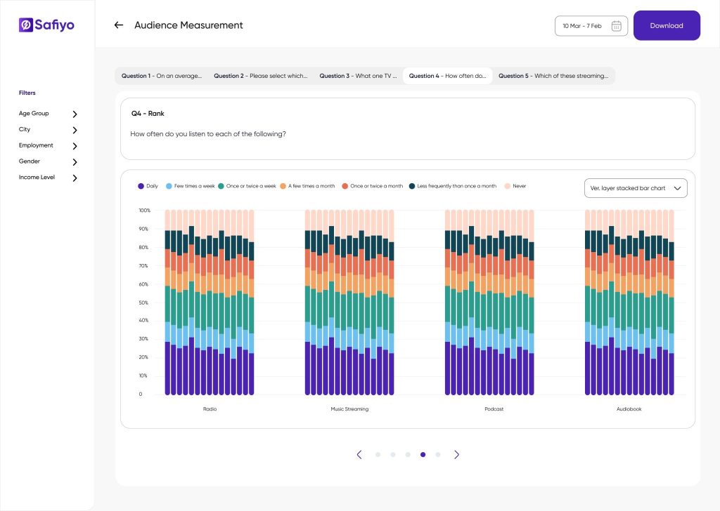
Audience Measurement dashboard on Safiyo, featuring a vertical stacked bar chart with intuitive color-coding and clear labeling. The implementation includes reusable chart components, left-panel demographic filters (e.g., Age Group, City, Employment), and a top-layered question navigator for multi-question analysis. The modular layout enables faster insight generation and allows users to toggle chart types, apply filters, and download reports seamlessly demonstrating the flexibility and scalability of the new design system.
App Analysis Heatmap within the Consumer Tracker dashboard on Safiyo. The design leverages a gradient-based heatmap to visualize user engagement across multiple apps and time intervals, enabling pattern recognition at a glance. Filters on the left allow granular segmentation by demographics and device data, while the pagination supports dataset scalability. The color scale beneath the chart aids interpretation of user volume. The clean, responsive layout and consistent UI components enhance readability and interaction, supporting quick behavioral insights for research and marketing teams.
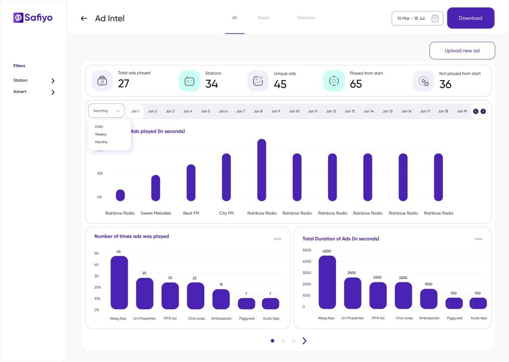
The implementation features interactive bar charts for ad duration and frequency, summary cards for key metrics (e.g., total ads played, unique ads), and a time-based toggle (Daily/Weekly/Monthly) for flexible data views. Filters for station and advert types enhance data segmentation, while the clean layout and reusable components support consistent and scalable reporting. The design prioritizes clarity, usability, and rapid comparison of ad effectiveness.
Consumption Analysis dashboard on Safiyo. The design uses a horizontal stacked bar chart to visualize beverage consumption patterns across different states and time periods. Each bar segment is color-coded by beverage type, enabling quick comparison of product popularity. The minimalist layout, clean typography, and soft color palette support data legibility and reduce cognitive load. Left-side filters allow for multidimensional data exploration, while the responsive card-based layout ensures usability across screen sizes making it ideal for FMCG analysts and brand teams seeking regional consumption insights.
Conclusion
The redesigned dashboard empowered Safiyo’s clients to make data-backed decisions faster while laying the foundation for long-term product scale. With reusable components and intelligent defaults, the system improved not just speed but also trust in data, usability, and revenue outcomes across Safiyo’s growing B2B portfolio.